From Mondrian to Indian Sarees: Completing the AECP Level 1 with a Creative Challenge
- carogeo2
- May 21, 2025
- 13 min read
Updated: Sep 28, 2025
Hello Crafty Friends!
Before we dive in, fair warning: this post is long — the kind of long that pairs well with a cup of tea, a cozy blanket, and maybe a snack or two.
Over the past few weeks, I’ve had an absolute blast taking on the AECP Level 1 Challenge. This creative adventure had me designing two coordinated gift sets — one For Her and one For Him. Each set includes five cohesive cards, carefully packaged with a touch of flair and a clever recycled twist. And to make things more exciting (and challenging!), the project had to reflect techniques from three specific classes I took along the way.
While inspiration came from all over the AECP curriculum, three classes shaped this project the most:
For the Guys
Clean & Simple Boutique Cards
Easy Die Cutting Techniques
Let me walk you through how each of those classes came to life in this project.
🎨 For the Guys: How It Inspired the Gift Sets
This class nudged me toward bold themes and striking visuals. It got me thinking about identity and style — what makes a card feel masculine or feminine, and how can we stretch that concept with creativity?
One card drew inspiration from Pop Art, another from retro video games — and that got me wondering: what if each gift set had its own overarching theme? A visual and emotional thread that ties all the cards together?
And so, the two themes were born:
Set 1 (For Him): Inspired by Piet Mondrian — bold primary colors, clean lines, and geometric order.
Set 2 (For Her): A tribute to the opulence and elegance of traditional Indian sarees — think vibrant colors, intricate layers, ornate patterns and golden accents.
These themes didn’t just guide the aesthetics — they shaped the entire design process, from color palette to die selection.
But that’s not all. I also took to heart several of the practical techniques emphasized in the class:
I leaned heavily on geometric patterns, using them to create bold, masculine structures throughout the For Him cards.
I used pencil guides before committing to glue — a small but essential trick for keeping lines sharp, straight, and intentional.
For texture, I pulled out stencils and pastes, adding tactile detail that elevated the otherwise clean layouts.
And in one case, I even resorted to custom coloring a tassel to get the deep purple hue I wanted for an accent element — a small detail, but one that made all the difference.
These techniques gave me a foundation to work from — a visual language, really — that kept the cards feeling cohesive without ever becoming repetitive.
✂️ Easy Die Cutting Techniques: Brought to Life
This class gave me the tools (literally and figuratively!) to push my die-cutting skills further. Throughout the project, I explored:
Using stamps with matching dies
Negative die cutting
Inlaid die cutting
Using die-cuts as stencils to double their utility
Each card became a mini playground for technique.
🧼 Clean & Simple Boutique Cards: The Finishing Touch
Every single card in this project fits the “clean and simple” aesthetic. Less can be so much more, especially when you include:
Thoughtful textures
Specialty papers
Subtle metallics
Coordinated envelopes and packaging
Now, let’s take a closer look at the first set.
✉️ Set 1: For Him — Mondrian-Inspired Minimalism
Step 1: Choosing the Colors and Mood
Mondrian’s iconic art is all about minimalism and a search for universal aesthetics. So I started with his go-to palette for abstract paintings: primary red, yellow, and blue, anchored in primary values black and white. My twist? Using Altenew’s Fresh Dye Inks in Coral Red, Mid Yellow, and Navy. These shades strike a great balance between modern vibrance and classic depth.
Step 2: Gathering the Tools
To bring this vision to life, I selected:
Die sets: Linear Crossroads, Hanging Garden, and Caps Bold Alphabet
Stencils: Color Block Triangle and the Abstract Patterns Builder Set
Stamp set: Illusion Diamonds for just the right sentiments
Inks & Papers: A curated combo of cardstock (white, black, red, yellow, and blue), glossy black specialty paper, and a rich, textured blue that mimics fine fabric
Step 3: Building the Foundation
I prepped five top-folding A2 card bases using Neenah Solar White 110 lb cardstock — sturdy and smooth, perfect for clean designs.
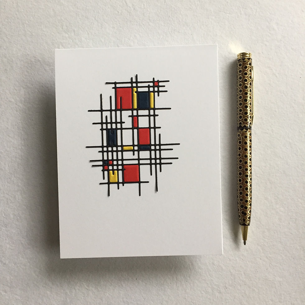
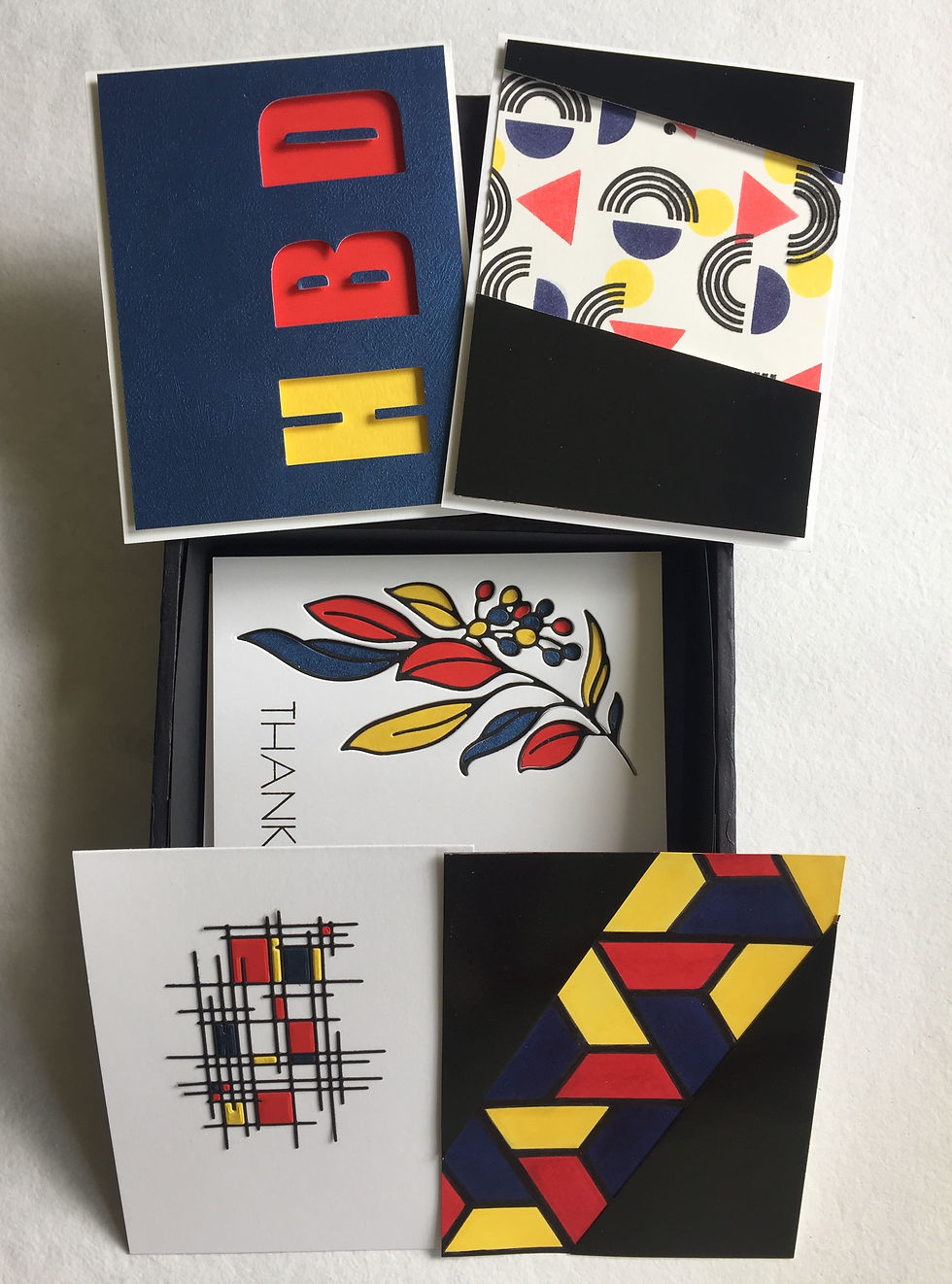
🖼️ Card 1: The Mondrian Grid
This card is a love letter to abstract geometry.
Using the Linear Crossroads Die, I cut four versions — one each in black, red, blue, and yellow. I used the black frame as my base, slightly offsetting it on the card front to break symmetry and draw the eye. Then, I carefully inlaid selected colored pieces, allowing red to take the lead.

Tip: For precision in layouts like this, a T-ruler is your best friend.
Bonus tip: Add double-sided adhesive before die cutting tiny pieces — it makes inlay work so much easier!
You might be wondering — where’s the sentiment? Good question. For this card (and several others), I left the front intentionally wordless. I didn’t want any text interfering with the abstract art. Most of my sentiments go inside the card — but more on that later.

🎨 Card 2: Primary Colors in Motion
For this design, I wanted to play with rhythm and movement, while staying true to the geometric style of the Mondrian theme.
Using the Color Block Triangle stencil, I created a diagonal band of primary colors across a white A2 panel — a bold pattern of yellow, red, and blue, all carefully masked to keep the edges crisp and the transitions clean.
But here's the twist: I didn’t center the design. Instead, I shifted the stripe to the side, letting the asymmetry add visual interest.

Tip: When working with multiple ink colors, keep your stencil, masking and hands clean between each step. It only takes one stray fingerprint or brushstroke to turn blue and yellow into an accidental green!
Once the ink blending was done, I reached for a black alcohol marker and darkened those white spaces to enhance contrast and make the colors pop. To anchor the design and hide the remaining white borders, I added two black triangles made from glossy cardstock.
The result? A dynamic, colorful card that still feels structured and intentional — like a little piece of modern art.

🌈 Card 3: Abstract Play with Texture
This one was a bit of an experimental joyride.
I dove back into the Abstract Patterns stencil set — three stencils, endless combinations — but decided to only use select shapes from each. With masking paper in hand, I got to work:
Stencil 1 (circles and blobs): I chose only the circles, blending them in bright yellow.
Stencil 2 (triangles and half-circles): I blended the triangles in red, and the half-circles in blue.
Stencil 3 (dots and rainbow shapes): Here’s where things got fun — I masked off the dots and used the symmetrical rainbow arcs, but this time with black texture paste for a pop of depth and drama.
Some of the rainbows overlapped with the colored shapes beneath, creating unexpected intersections that felt playful yet polished.
DIY tip: No black texture paste? No problem. Mix white paste with a bit of black re-inker or pigment powder. Go slow — add color in small amounts and test it before applying it to your final project. Just note: liquid colorants can alter the consistency and drying time.
To finish, I trimmed the panel down to 4" x 5 ¼", then framed it with a bold black accent. I cut a glossy black cardstock rectangle diagonally and popped both halves up with foam tape to create a sleek dimensional border. Just like that, Card 3 was done — moody, modern, and full of movement.

📌 Card 4: Minimalist Birthday Geometry
What’s a card set without a birthday card? But don’t worry — this one sticks to the bold minimalism I’ve been committed to throughout the set.
For this design, I reached for Altenew’s Caps Bold Alphabet Die Set. The font is sturdy, clean, unapologetically geometric — just right for a masculine, Mondrian-inspired theme.

I started by lightly penciling in the spacing for three letters: HBD — short, sweet, and universal. I did the initial die-cutting on a white panel (because pencil marks show up better there), then left the taped dies in place, positioned my blue specialty cardstock panel behind it and die-cut the same design again. With both panels perfectly aligned, I adhered the white one behind the blue for added structure and support.

Now for the fun part: behind each letter’s negative space on the card front, I glued a pop of primary color — yellow behind H, red behind both B and D. The color choices weren’t random — yellow for “Happy” and red for “Birthday,” separating the sentiment visually while keeping it cohesive.
Then I popped the blue die-cut panel up with foam tape, aligning it precisely over the colored rectangles. For the final flourish, I inlaid the inner pieces of the letters B and D using teeny bits of foam tape.
Tip: Use the actual letter die-cuts as a guide when placing the inner shapes into their negative spaces. Just be gentle when peeling the guide letters off — trust me on this.
Clean, bold, and unmistakably celebratory — Card 4 was complete.

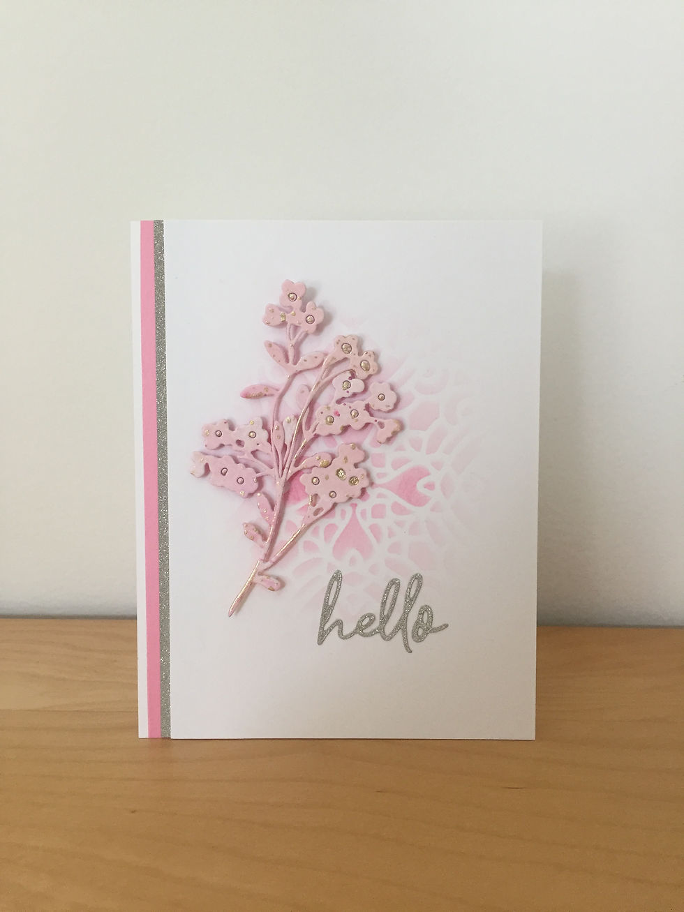
🍃 Card 5: Organic Elegance Meets Modernism
By this point, I felt it was time to break the grid — just a little.
While Mondrian is known for his geometry, he also painted landscapes, trees, and flowers. So I allowed myself to bring in one organic element, carefully balanced against the otherwise strict lines of the set.
I reached for the Hanging Garden Die Set and cut the larger leafy branch shape from a white panel, keeping it clean and centered.
Then came a little color play: I cut the same shape from black, red, yellow, and blue cardstock. This card, like the last, uses a combination of negative die-cutting and inlay techniques — but with a more natural form.
Before assembling, I stamped “Thanks” onto the white panel with Obsidian Pigment Ink — yes, this card includes a sentiment on the front! With foam tape, I popped the panel onto a white card base and nestled the black outline of the branch into the recessed negative space. I inlaid the colorful leaves and berries next, letting them pop in their primary hues against the monochrome background.
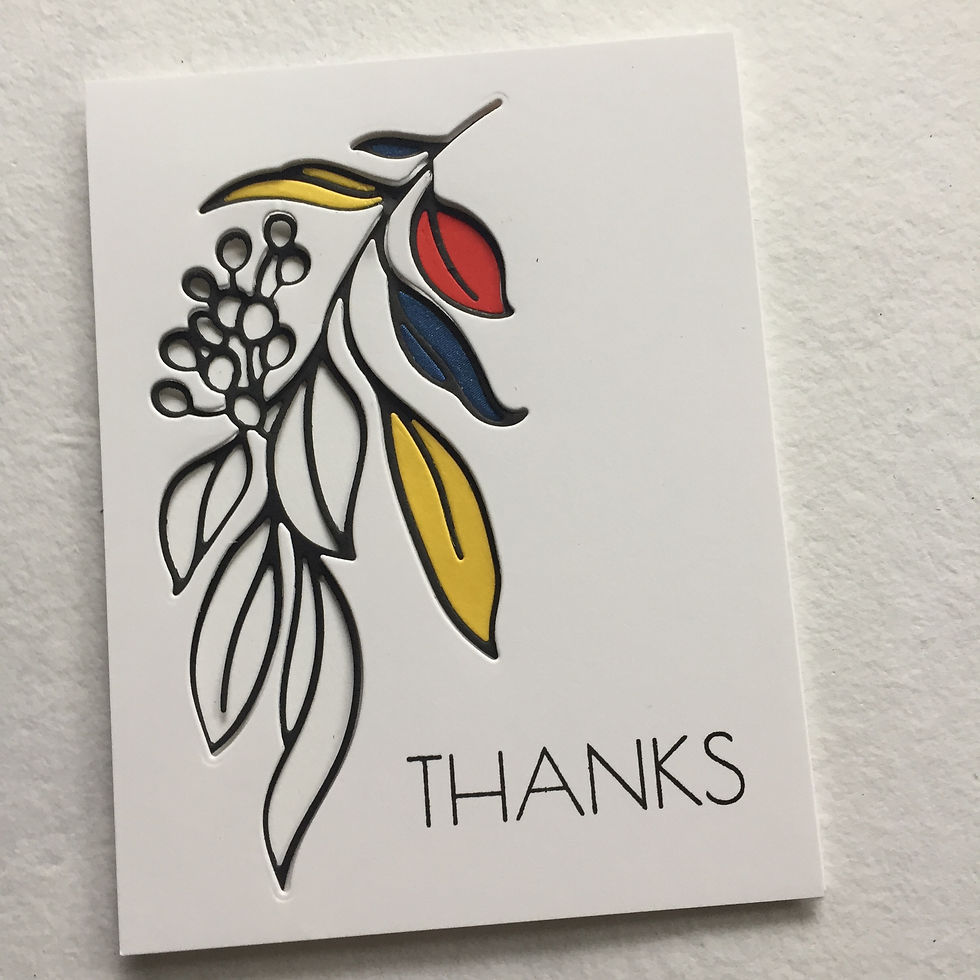
Elegant and heartfelt — a quiet standout.

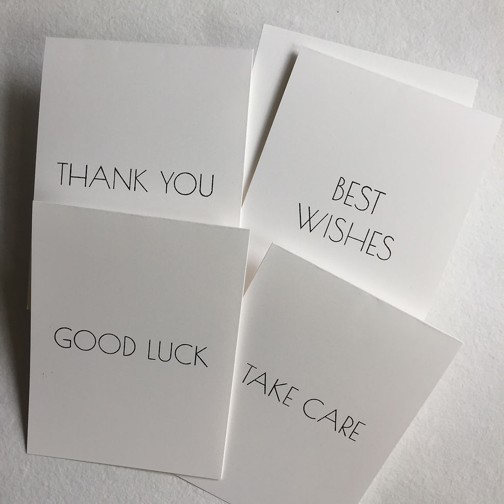
💬 Sentiments: Flexibility Meets Function
Instead of stamping sentiments directly onto the cards, I created removable card inserts cut from 60 lb smooth white cardstock, just the right weight and texture for clean stamping.
Tip: Use a Grid Transparency as an alignment guide to center your sentiment.

Each insert is 4" x 5¼", sized to fit perfectly inside an A2 card. I stamped four of them with simple all-caps sentiments using the Illusion Diamonds Stamp Set. The font is modern, minimal and some might say masculine — a natural fit for the set’s aesthetic. The fifth insert I left blank. It can be paired with Card 4 or 5.
Bonus: This approach gives the recipient flexibility. Use the inserts or don’t. Swap them out. Mix and match. Personalization made simple.
🎁 The Packaging: A Recycled Reinvention
Each card is paired with a deep navy envelope that ties the set together and echoes the primary color palette while adding a refined touch. Then it's time to think about the packaging. Here’s where things got a little messy — but creatively so.
I had this sturdy magnetic box that fit a set of A2 cards like it was made for it. But the design on the outside? Not quite right. It didn’t align with the Mondrian-meets-modern vibe I was going for.
I didn’t want to bulk it up with heavy cardstock and risk compromising the magnetic closure. So instead, I wrapped the entire box — inside and out — with black tissue paper. The result? A smooth, seamless, matte-black finish that looked modern, masculine, and intentional.

And remember those leftover die-cut scraps from Card 1 (from the Linear Crossroads Die)? I repurposed them as minimalist embellishments on the box, creating just the right nod to the bold geometry inside — without overpowering the sleek black surface.
A perfect final touch for a bold, modern card set.

✉️ Set 2: For Her — Vibrant Colors and Elegant Layers
Step 1: Choosing the Colors and Mood
This set draws inspiration from traditional Indian sarees — celebrated for their vivid colors, flowing layers, intricate patterns, and golden accents. I wanted to capture that elegance and warmth in a palette of vibrant tones: fuchsia, orange, and violet. To bring these hues to life, I turned to Altenew’s Fresh Dye Inks in Fuchsia, Snapdragon and Midnight Violet.
Step 2: Gathering the Tools
To interpret the opulence and texture of sarees on paper, I assembled the following materials:
Focal and floral elements: One-Go Friendship Flowers Stamp, Stencil & Die Set, Climber Flowers Die Set, Craft-A-Flower: Tulip Layering Die Set
Decorative layering dies: Ornate Nesting Die Set, Ornamental Lantern Layering Die Set, Ornate Cover Die, Ornamental Poppies Cover Die, Doodled Lace Cover Die, Floral Lace Die, Linear Crossroads Die
Embossing & texture tools: Angled Mosaic 3D Embossing Folder, Botanical Line Art 3D Embossing Folder (from Craft Your Life Project Kit), Castle Motifs Stencil, Color Block Triangle Stencil
Sentiment stamps & dies: Fragile Foliage Stamp Set, Fancy Greetings Stamp Set, Miss You Fancy Die
Mediums & paper: Altenew’s Shimmer Relief Paste in Enchanted Gold and Pearl, Diamond Glaze, Neenah Solar White cardstock (110 lb and 80 lb), watercolor cardstock, Brushed Gold Metallic cardstock, Gilded Glitter cardstock (in Golden Beryl), off-white satin cardstock
Ink for stamping sentiments: Obsidian Pigment Ink
Step 3: Building the Foundation
I began by preparing five top-folding A2 card bases from 110 lb Neenah Solar White cardstock — a durable, smooth base that holds up beautifully to layers and some mixed media. I also cut ten A2-sized panels from the same paper and one oversized panel (twice the size of an A2 card) from 80 lb cardstock for stamping and stenciling.
Step 4: Creating Background Layers
Just as sarees are known for their luxurious layers of satin and silk, these cards also feature multiple layers — both visual and tactile. Each base received a unique treatment: some were embellished with cover dies, others with stenciled Shimmer Relief Paste or dry embossed with 3D folders.


I even created visual texture using acrylic paint on a gel plate — there’s a short video showing how I recycled packaging to make a shimmering gold-on-white print. Once that print was pulled, I let the leftover bits of gold paint dry, then added purple acrylic paint to lift the remaining gold and create a magical purple-and-gold two-tone effect (see Card 4 below).
For the next layer, I cut smaller decorative panels using the Ornate Nesting Die Set. These, too, were given various treatments — 3D embossing, cover die overlays, or shimmer paste stenciling.


Each panel was mounted to its base using Instant Dimension Foam Tape for added depth.

Step 5: Creating the Focal Images
Some focal elements were created with the One-Go Friendship Flowers — stamped, ink-blended, and die-cut in the chosen color palette, with highlights of Enchanted Gold Shimmer Paste.

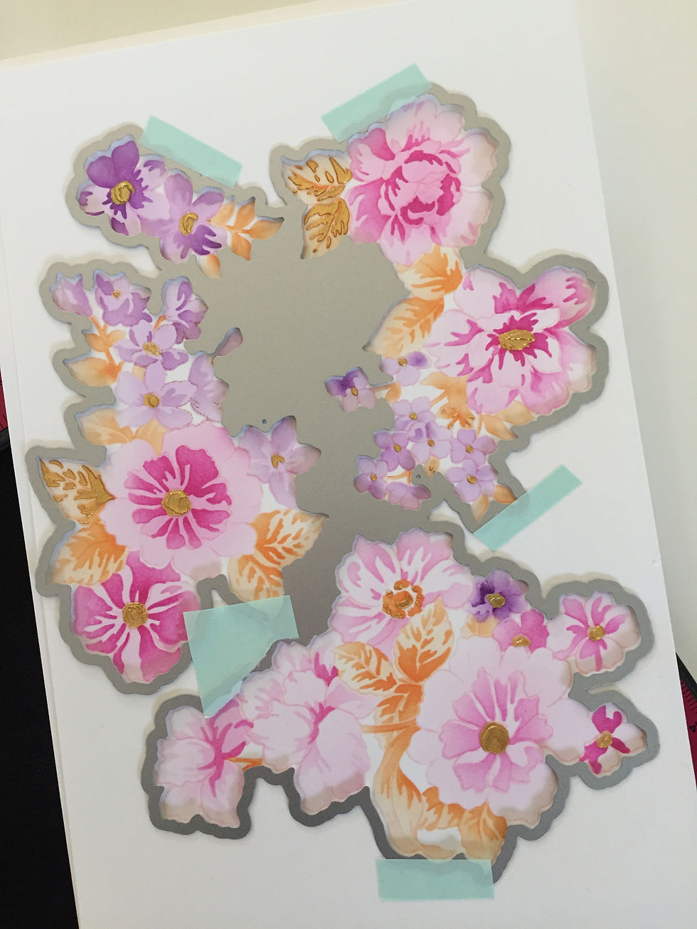

Others were built from watercolored panels and die sets for a more layered, opulent look.
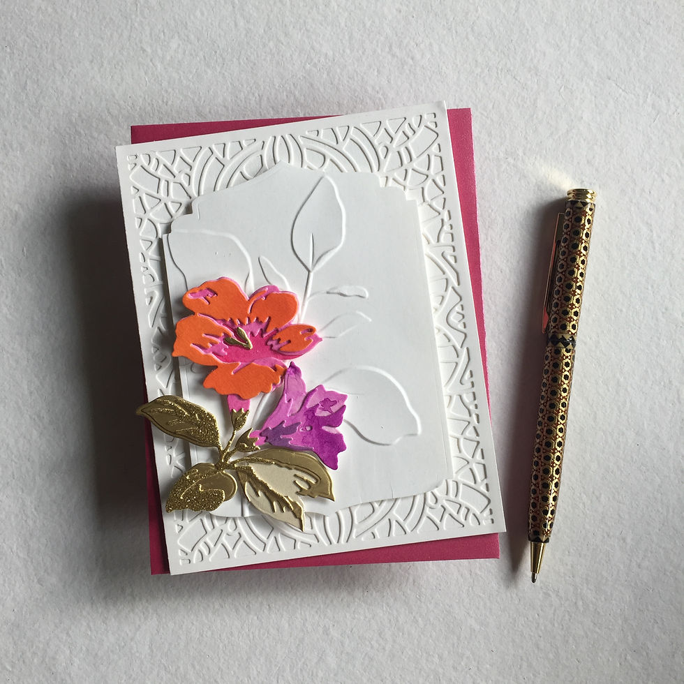
To loosely connect this set with the first, I began by watercoloring a panel in pink, orange, and purple, then stenciling Enchanted Gold paste through a Linear Crossroads die-cut. After it dried, I used that panel to cut layers for the Tulip Layering Die Set and assembled the flowers using the layering guide.


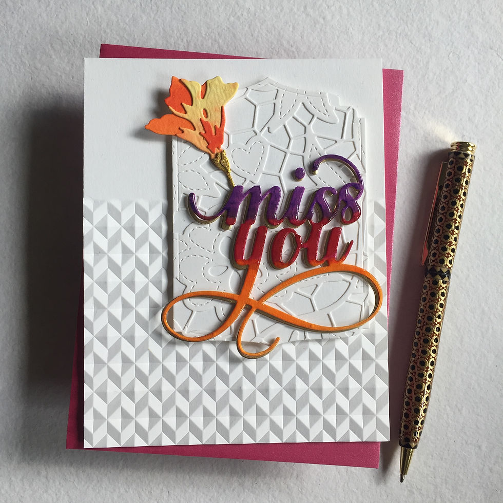
As in the first set, one card features a sentiment as the focal point. I die-cut the Miss You Fancy sentiment from handmade watercolor cardstock, returned it to its negative space, and watercolored it using ink from all three ink pads.

Once dry, I coated it with several layers of Diamond Glaze (which I store in a recycled nail polish bottle — perfect for bubble-free application). For added depth, I die-cut the sentiment a second time from Brushed Gold Metallic cardstock and offset it slightly behind the first.
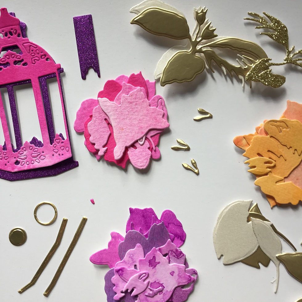
For the Climber Flowers and Ornamental Lantern, I dove into my stash of painted scraps, pulling bits of pink, purple, and orange, plus metallics and glitter cardstock, to build lush, dimensional images.
Step 6: Assembling the Cards
Once all the components were ready, I began assembling.
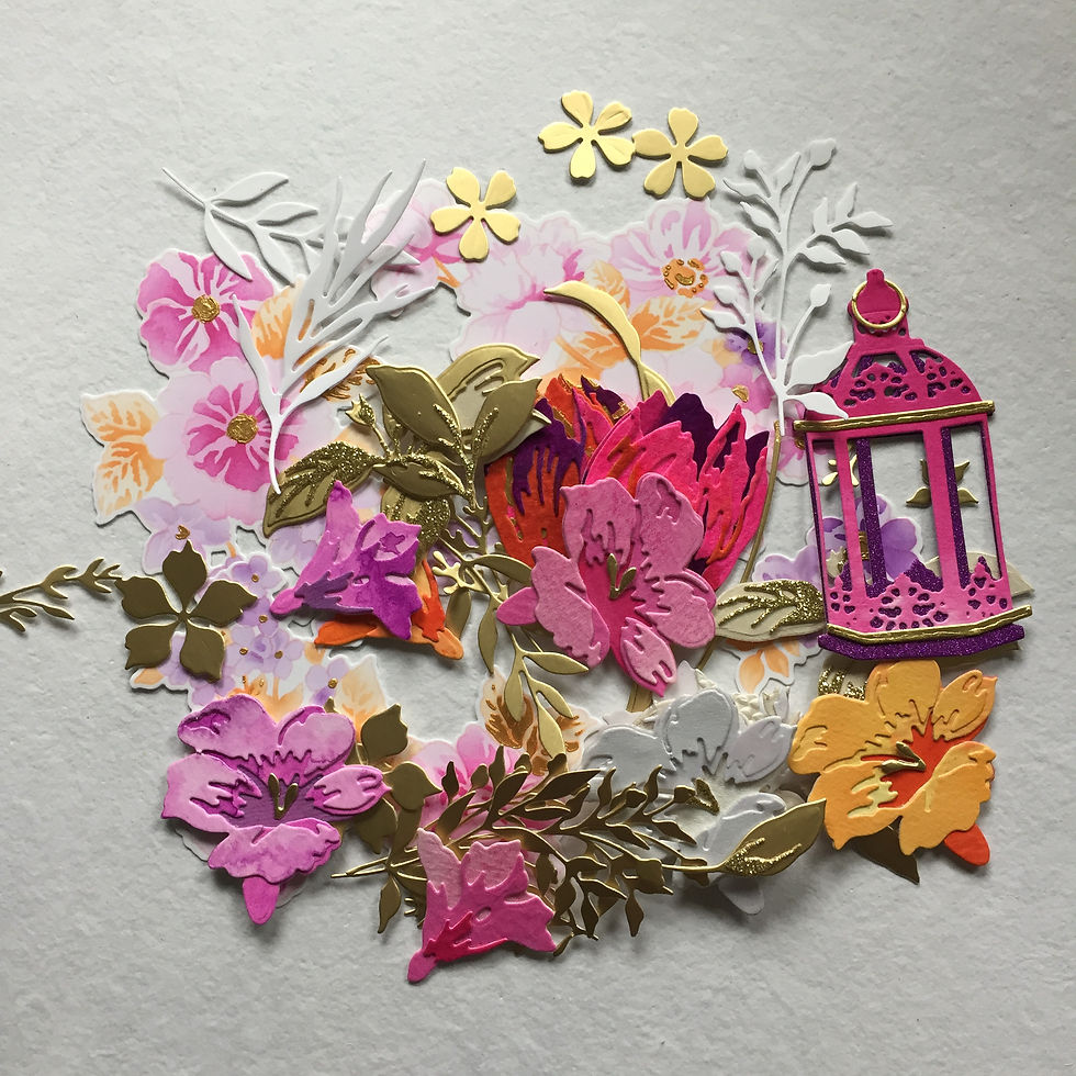
Each focal image was mounted with Instant Dimension Foam Tape, allowing the layers to truly shine.

As with the first set, I leaned into asymmetrical layouts — some focal elements are placed to the left, others to the right, keeping each card dynamic and unique.
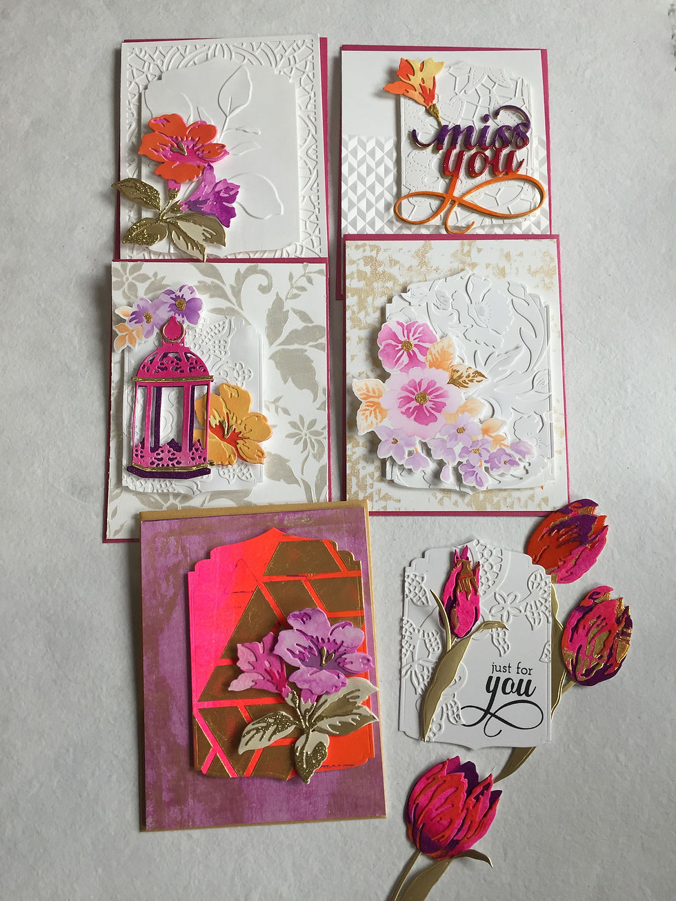
Here’s a quick overview of the finished five:
Card 1: Features the stamped Friendship Flowers on a white bed of poppies, layered over a gel-printed white-and-gold base.

Card 2: Highlights the Climber Flowers against an embossed leafy background, layered on an Ornate Cover Die base.

Card 3: Showcases the tricolor Miss You Fancy sentiment with a small Climber Flower, mounted on an ornamental panel with the Doodled Lace Cover Die over an Angled Mosaic partially embossed card base.
Card 4: The boldest of the set — the ornamental panel, cut from a neon pink-and-orange gel print, features a diagonal stencilled band of Enchanted Gold paste (via the Color Block Triangle Stencil) and is topped with a cluster of Climber Flowers in pink, purple and gold over the purple-and-gold two-tone gel print.

Card 5: Displays the Ornamental Lantern in pink and purple with two floral cluster adding orange, all layered on a white ornamental panel covered with the Floral Lace Die over a shimmering pearly white stencilled card base background of flowers and leaves courtesy of the Castle Motifs Stencil.


As for the tulips — I confess I created more focal elements than I needed! But one found its place on a small gift tag that will be included with the set’s packaging.

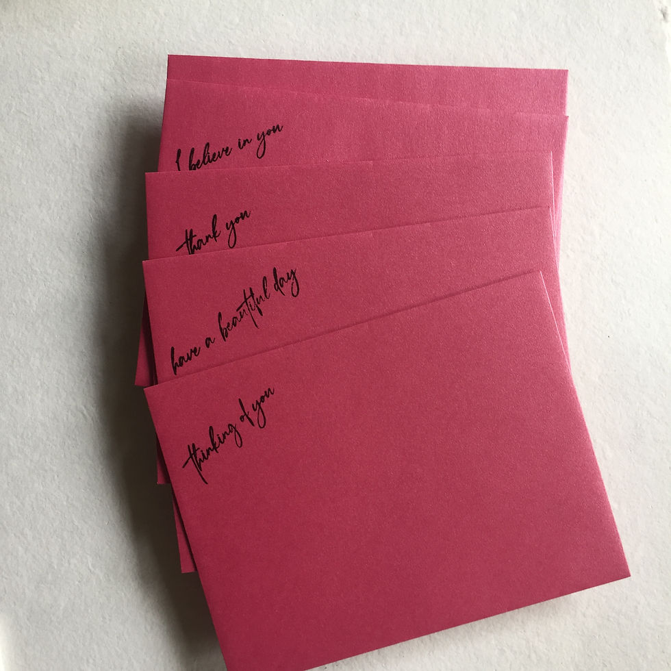
💬 Sentiments: Flexibility Meets Function
Just like in the first set, I kept the card fronts sentiment-free (with one exception). But instead of including sentiment inserts, I stamped sentiments in a scripty font from the Fragile Foliage Stamp Set in Obsidian Pigment Ink directly onto pink metallic envelopes. This gives the recipient the freedom to match the sentiment to the occasion.
🎁 The Packaging: Wrapped in Fabric, Tied with Gold
To complete the gift set and stay true to the saree-inspired theme, I visited a saree shop and purchased a yard of vibrant pink fabric. I folded it down several times (without cutting!) to a manageable size and used it to wrap the cards and coordinating envelopes — a thoughtful touch that also leaves the fabric intact, and a gift in itself for a future sewing project.
To hold everything together, I tied a wide purple and gold ribbon, topped with a narrow orange ribbon and bow, echoing the color palette of the cards. For the final embellishment, I added a custom-colored tassel to the bow — a nod to the decorative finishings often found on sarees.

The finishing touch: a custom tag — an Ornate Nesting Die cut panel, partially covered with Floral Lace, stamped with “Just For You” from the Fancy Greetings stamp set and adorned with one of the tulips. Tucked behind the ribbon, it mimics the shape and style of the layered card panels — tying the presentation back to the cards inside.

And that’s a wrap — quite literally! If you’ve made it all the way to the end, thank you from the bottom of my heart. I hope you enjoyed this vibrant, layered journey. I’d love to hear your thoughts — and if you’re anything like me, I hope you’re now inspired to wrap your next card set in silk and gold. 💛


I am blown away by the attention to detail to each and every card you have created, Caroline! I am amazed you were able to create such unique creations in such a limited amount of time! Bravo! You have done an AMAZING job! What a wonderful array of projects, incuding the packaging. Top job!