Fifty Shades of Green Inspired by Nature & AECP Level 2 In the Mood for Color
- carogeo2
- May 29, 2025
- 3 min read
Updated: Jun 5, 2025
Hello Crafty Friends!
As I sit by the window, all I see is green—chartreuse, emerald, blue-green, yellow-green, light, dark, soft, bold—every tint, shade and tone imaginable. It’s a rainy day, the kind that makes the garden and trees come alive in lush, saturated color. Even the gray sky fades into the background when you're surrounded by so much freshness.

To me, green means renewal. It brings to mind new beginnings, hope, strength, optimism, beauty and the quiet power of nature. It’s a color full of possibility and calm—and the perfect choice for today’s project.
Inspired by the view outside and my second AECP Level 2 class, In the Mood for Color, I created a card that captures the soothing, natural, and growth-filled essence of green. In the class, we explored how color can express mood and emotion—both your own and what you hope to evoke in the recipient.
A Green Card for a Fresh Mood
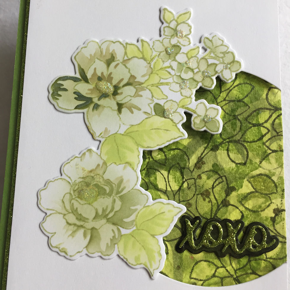
I started by ink-blending my card front with a soft, yellowish green. Then, using the Leaf Bed Stencil, I layered in deeper green tones for dimension and depth. Some mossy green specks and splatters added texture, and I finished off the background with repeated leaf stamping from the Mini Branch Set in Green Opal Fresh Dye Ink—pure green goodness! To frame the edge, I added a narrow strip (3/8 inch) of pearlescent green cardstock along the left side.
For the next layer, I trimmed a white card panel slightly narrower than my base and die-cut a nearly complete circle from the lower right corner. A sliver of green glitter cardstock on the left tied it all together. When I popped this panel over the stenciled background, it created a window of lush greenery—subtle, yet striking. The slim borders of sparkling green on the left side added just the right amount of shine. It’s an old technique I used to love well over a decade ago, and thanks to the Let It Shine class, I’ve happily rediscovered it as a lovely finish for clean and simple designs.
Florals, Sparkle, and a Sentiment
For the focal point, I reached for my current favorite floral cluster from the One-Go Friendship Flowers set. Stamped in Misty Sage Fresh Dye Ink, it has somewhat of a semi-circular shape—perfect to frame the die-cut window. Using the coordinating stencils, I ink-blended the blooms with Pistachio, Mossy Meadow, and Green Opal, and shaded the leaves with Limeade, using a light touch for the first layer and more pressure for the second. A touch of Star Dust Stickles in the flower centers catches the light just right, adding a delicate sparkle.
To finish the card, I die-cut the sentiment and its shadow from the XOXO & More Die Set using the same green cardstocks featured on the card’s edge. At first, the pearlescent shadow blended in a bit too much with the busy background—but a quick touch-up with an Artist Marker in Green Opal gave it the contrast it needed. Once everything was adhered, this fresh green marvel was complete!
I’d love to hear what you think! What color would you choose for a monochrome card—and what does that color mean to you?
Thanks so much for visiting. If you feel inspired to create after reading this, I’d be thrilled to see your project—feel free to tag me on Instagram @caracaro33. Until next time, stay crafty and colorfully inspired!


Oh, I love the color! Looks gorgeous! Perfect amount of sparkle too!